Visual hierarchy is how designers organize elements to ensure that your eyes move to the correct places first. Visual hierarchy provides flow to the design by taking your eyes from the key message to the smaller details smoothly. Without visual hierarchy, even the best design may look chaotic.
At O’Dell Design Co., visual hierarchy is the rhythm of design. Visual hierarchy is more about what happens to your eyes as you move them over the design rather than what is happening on the surface.
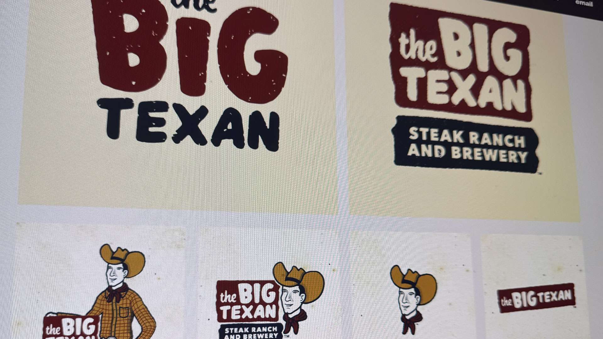
Hierarchy in Logo Designs
Although logos appear to be straightforward designs, it is actually the use of hierarchy that makes them functional. The logo may contain a name, symbol, and possibly taglines; each one must take its own place in the limelight.
- The main element, like the wordmark or icon, should be what people notice first.
- Supporting details, like a tagline, should stay in the background. They add context without competing with the main element.
- Good balance keeps everything working together without visual noise.
Consider the Nike swoosh or the Starbucks logo. Each employs the use of hierarchy to ensure that one element is made to stand out while the others are subdued.
Hierarchy in Graphic Design
When you transition past the logo to other areas such as posters, packaging designs, and web pages, the role of hierarchy becomes more significant. Hierarchy ensures that complex data is presented in an effortless-to-understand manner.
Some of the most fundamental apparatus that we use in establishing hierarchies include:
- Scale: Larger features draw more eyes.
- Color and Contrast: Using bright colors or contrasts leads the viewer’s eyes.
- Typography: Using different weights and sizes brings about a flow that is more natural.
- Spacing: Using white space helps to ensure that critical areas stand out.
- Placement: Others read from the bottom to top. This is how one places items in that culture.
When done correctly, the use of hierarchies can facilitate your audience understanding your message without even realizing it.
How to Build Strong Hierarchy
These are just a few approaches you can take to inject clarity and order into your design process:
- Select a focal point. Each design should include one clear focal point.
- Work with contrast. Contrast can be achieved through color difference, size difference, and weight difference.
- Be consistent. In alignment and repetition lies trust and order.
- If everything is made to stand out, then nothing will stand out.
Test your design. Take a step back and look to see where your eyes go first. If it’s not pointing to the area you intended, then adjust.
Why It Matters
Hierarchy is more than a design technique. Hierarchy has roots in psychology. Humans process visuals before words. Hierarchy determines how your message is felt before it’s even read. When you design with great hierarchy, you come across as confident, organized, and trustworthy.
At O’Dell Design Co., we believe that hierarchy is essential to every successful project. Whether it’s designing a logo or solving visual identity design projects, intention always leads to clarity.
Hierarchy free design is decoration. Design with hierarchy communicates. If you want people to relate to your visuals, then lead with meaning rather than color and design. You need to create hierarchy in your visual presentation so that your design speaks for itself.
Ready to elevate your brand visuals with confidence and clarity? Let’s make something that says a lot without needing to say a word. Get in touch with O’Dell Design Co. today and let’s make design that feels as good as it looks.