Logo icons are designed for impact. They catch the eye, trigger recognition, and give people something to remember. But once that first impression is made, most brand interactions move quickly beyond the icon.

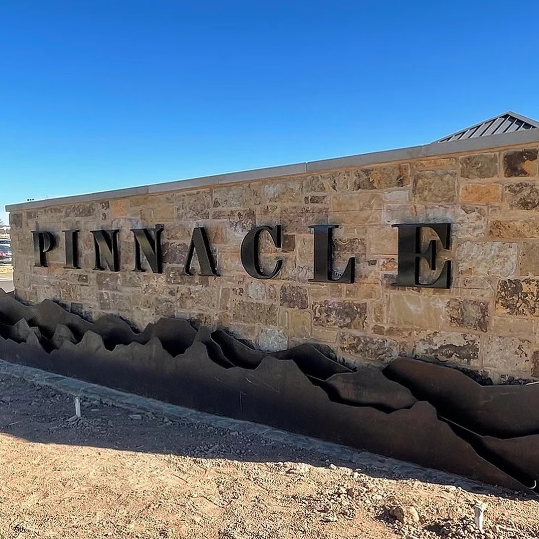
Customers spend far more time reading your words than looking at your symbol. Websites, packaging, emails, signage, and apps rely heavily on typography. The typeface becomes the primary way your brand communicates on a daily basis. If the icon is the handshake, the typeface is the conversation that follows.

Typography Carries Personality, Not Just Letters

Typefaces are emotional tools. They express tone before a single word is read.

A clean sans serif can feel modern and efficient. A serif can feel established and trustworthy. Rounded letterforms can feel friendly, while sharp or condensed styles can feel bold and commanding. These cues happen instantly and subconsciously.

When the typeface does not align with the brand’s personality, people sense something is off. Even a well-designed icon cannot fix that mismatch. Strong identity systems make sure the typography and icon are speaking the same visual language.

Consistency Lives in the Typeface

Icons appear in specific places. Typefaces appear everywhere.

Over time, consistent typography becomes one of the strongest brand signals a company has. People start to recognize a brand from a headline, a product label, or a social post even before they see the logo. That recognition comes from repeated, intentional use of the same type system.

Without a clear and well-chosen typeface, brands often default to whatever font is available, which weakens consistency and dilutes recognition.

Leals 1
Leals 2020 Social Puns15
Leals 2020 Social Puns16

Readability Is Brand Trust

Typography is not just about style. It is about usability.

If text is hard to read, too thin, too cramped, or poorly spaced, it creates friction. Friction erodes trust. A brand may look great at a glance, but if reading feels like work, the experience suffers.

A strong typeface supports long-form reading, works across devices, and holds up in different sizes. It quietly reinforces professionalism and care, which are essential to building credibility.

Typefaces Are Systems, Not Single Assets

Icons are static by nature. Typefaces are flexible systems.

A well-selected type family includes multiple weights and styles that allow designers to build hierarchy, emphasis, and rhythm. Headlines, body copy, captions, and legal text can all feel related while serving different purposes.

This flexibility allows a brand to scale across platforms without losing its identity. When the type system is weak, brands end up patching things together, which leads to inconsistency and visual noise.

Buns Over Texas 01
Buns General Sayings 2017 04
Buns General Sayings 2017 01

The Icon Is the Face. The Typeface Is the Voice.

A brand icon might introduce you, but the typeface is how you speak every day.

When companies treat typography as an afterthought, the brand feels incomplete. When they give it the same attention as the icon, the entire identity feels intentional and confident.

The strongest brands understand that people do not just remember what they see. They remember how it feels to read, interact, and engage. Typeface selection shapes that feeling just as much as any logo mark ever could.

Ready to Build a Brand That Actually Holds Together?

A strong logo is not just a great icon. It is a system where typography, symbols, and structure work together to tell a consistent story everywhere your brand shows up.

O’Dell Design Co. specializes in logo and identity systems that go deeper than surface-level design. From icon creation to thoughtful typeface selection, every detail is crafted to feel intentional, usable, and built to last.

If you are ready to create a brand that speaks clearly, confidently, and consistently, hire O’Dell Design Co. for your next logo or identity project. Let’s build something that people recognize and remember.

Share