This past year I was honored to have 3 of my logos included in the 2018 LogoLounge Trends Report by Bill Gardner.
Every year LogoLounge does a comprehensive analysis of the trends in logo designs and organizes them by category.


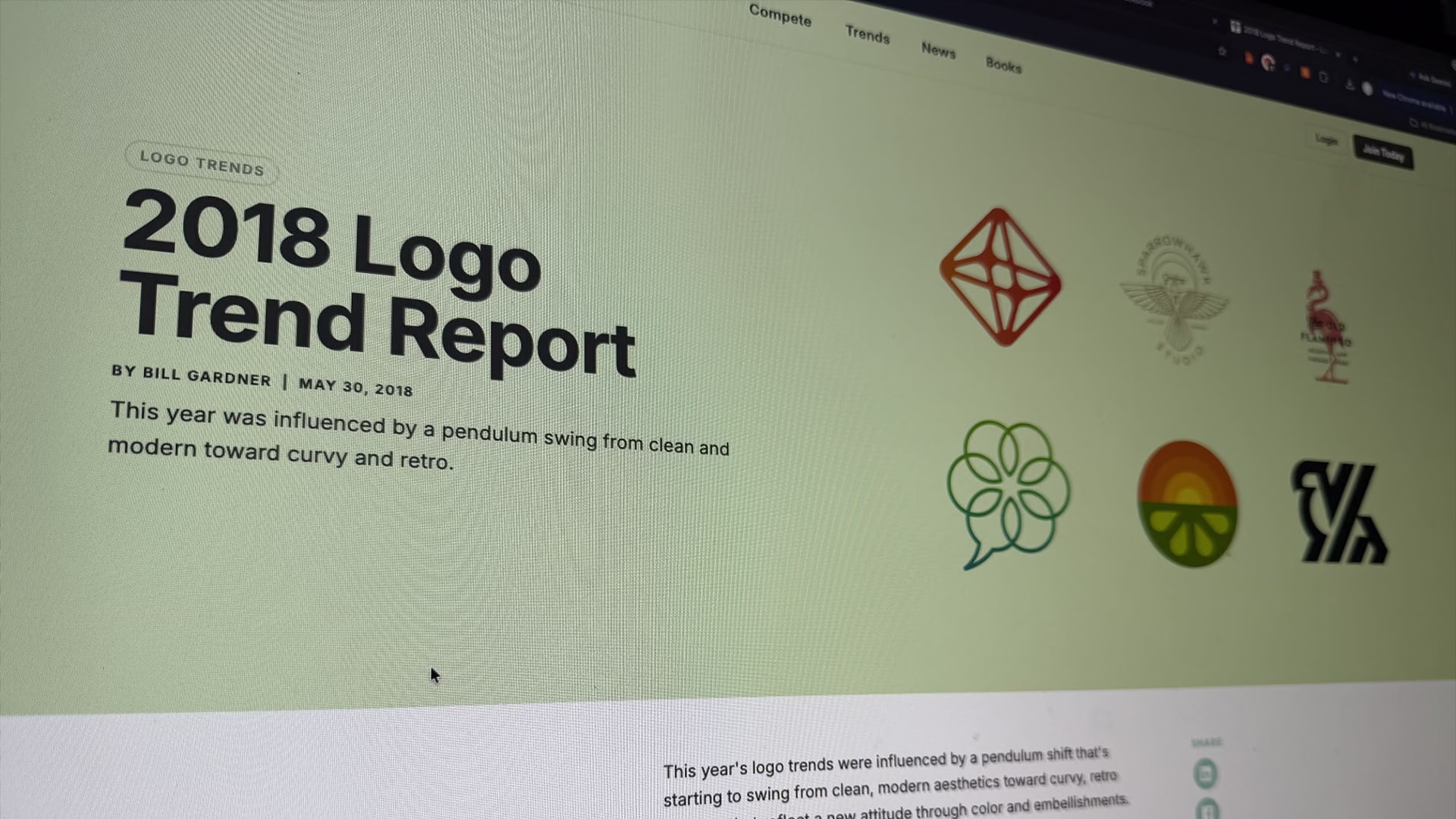
This year’s logo trends were influenced by a pendulum shift that’s starting to swing from clean, modern aesthetics toward curvy, retro designs that reflect a new attitude through color and embellishments.
Any time we look at trends, we tend to see that there is a pendulum that is swinging. For instance, it’s not uncommon to see an evolution from a flat logo to something dimensional or vice versa. But over the last three years in particular, from a typography standpoint, we’ve seen a transition toward very austere sans serif logos. Google flipped from a serif font to a sans serif, and other major brands like Verizon, Calvin Klein, and Century 21 did the same.
Part of what’s going on here is this idea of clarifying the message and conveying transparency. Unfortunately, it also strips these brands of any personality when it becomes too sterile. However, this year, the pendulum is starting to swing in the other direction as a direct reaction…